In cosmetic packaging, color and surface finish are not separate decisions—they work together to shape consumer perception. A well-chosen combination of shade, gloss, and texture can elevate even a minimalist design, creating a cohesive and premium impression.
Different finishes interact with color in subtle but important ways. In this article, we explore how color finish pairing can enhance cosmetic packaging. We’ll look at practical combinations, the psychological effects of different pairings, and real-world examples from brands that successfully use color and finish to reinforce brand identity.
How Different Finishes Interact with Color
Surface finish significantly affects how color is perceived in cosmetic packaging.
Glossy surfaces amplify brightness and saturation, making colors appear more vibrant and energetic.
Matte finishes, on the other hand, absorb light and create a softer, more subdued look, communicating calmness and restraint.
Satin or metallic accents can introduce subtle reflections that add depth, elegance, and a sense of sophistication.
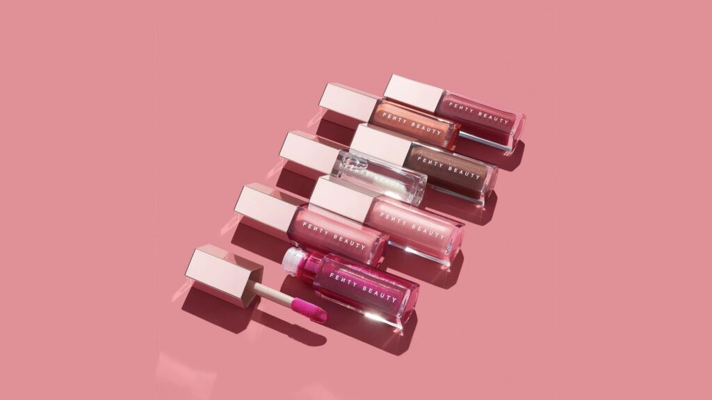
Fenty Beauty often pairs vibrant lipstick shades with high-gloss packaging to reinforce energy and visual impact.
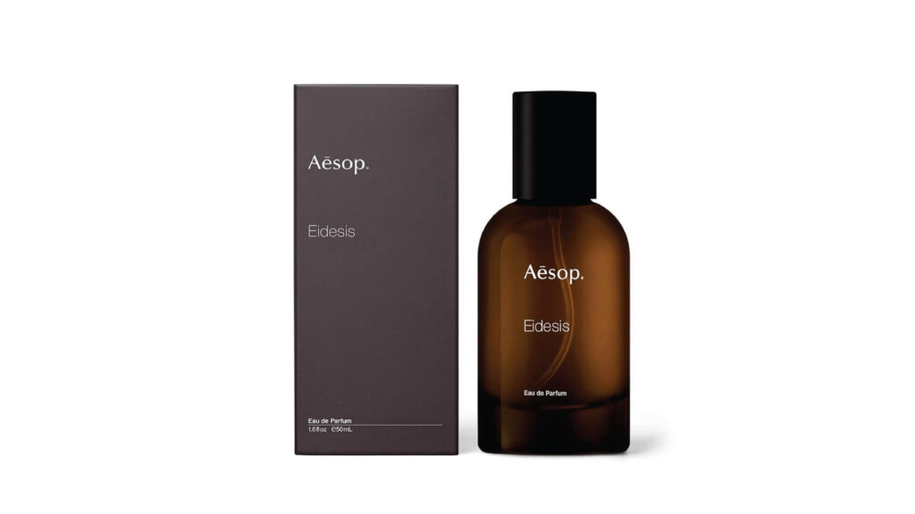
Conversely, Aesop uses low-saturation tones with matte surfaces in its skincare packaging, enhancing a sense of calm, precision, and premium quality.
The interplay between color and finish is particularly important in minimalist or luxury packaging. Understanding these subtle interactions allows brands to design packaging that aligns with both product positioning and consumer expectations.
Practical Color + Finish Combinations for Different Cosmetic Categories
1. Makeup Packaging
For color cosmetics, vibrant shades often pair best with glossy finishes. Gloss not only amplifies the brightness of the product but also draws consumer attention on the shelf.
Pat McGrath Labs pairs high-saturation lipstick colors with high-gloss packaging to reinforce visual impact and a luxury feel.
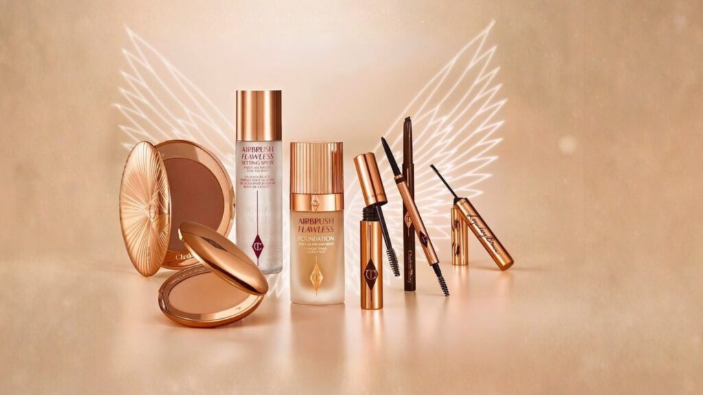
Charlotte Tilbury combines metallic details with glossy bottles, emphasizing the premium quality of its color cosmetics.
2. Skincare Packaging
In skincare, muted colors and low-saturation tones are preferred. Matte or soft-touch finishes communicate calmness, precision, and reliability. Subtle metallic highlights can be used sparingly for luxury lines, adding sophistication without overwhelming the minimalist aesthetic.
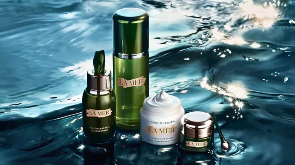
La Mer uses soft-toned bottles with satin or matte finishes to convey refinement and professionalism.
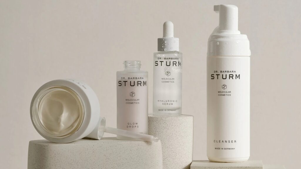
Dr. Barbara Sturm combines low-saturation matte packaging with minimalist design, emphasizing scientific credibility and high-end positioning.
3. Fragrance Packaging
Fragrances often benefit from a mix of finishes. Glossy or satin finishes can enhance premium perception and make metallic caps appear more refined. Gradient effects or partial metallization can emphasize the luxurious, multi-dimensional character of limited-edition scents.
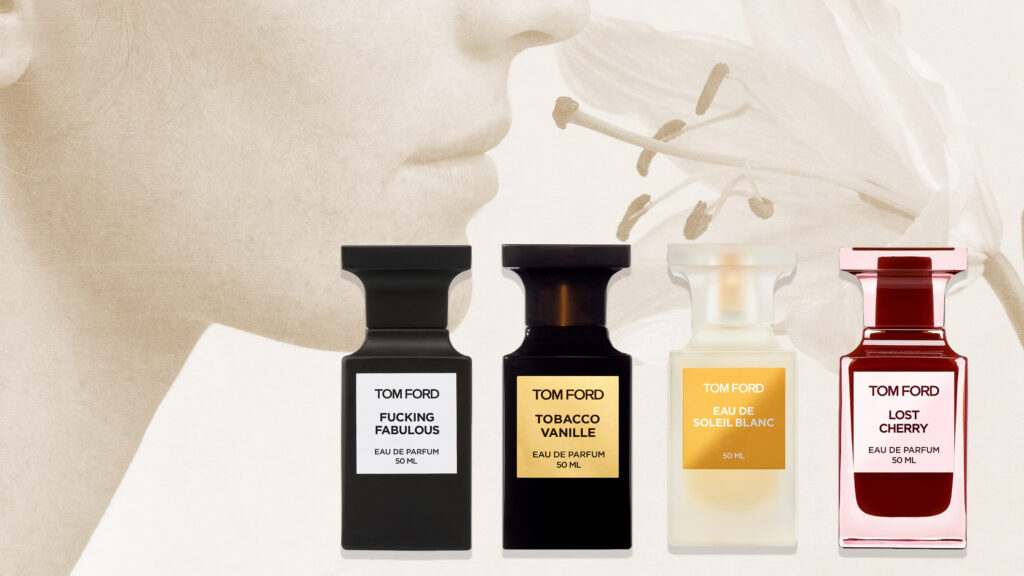
Tom Ford uses deep, dark matte bottles with metallic accents on caps and labels, creating contrast and a sense of layered sophistication.
By understanding these practical combinations, brands can strategically select finishes and colors to reinforce both product positioning and brand identity across different cosmetic categories.
Guidelines for Selecting Color + Finish Pairings
Choosing the right combination of color and surface finish requires a clear understanding of both brand positioning and consumer perception. Here are practical guidelines:
Align with Brand Identity
The pairing should reflect the brand’s personality. Luxury brands often favor low-saturation tones with matte or soft-touch finishes to convey sophistication, while energetic or bold brands may choose vibrant colors with glossy or metallic accents.
Consider Material Properties
Different packaging materials respond differently to finishes. Plastics, glass, and metals have unique interactions with coatings, gloss, and texture. Understanding how each material affects color appearance is critical for maintaining consistency across components.
Learn more about material behavior in cosmetic packaging by referencing resources like Understanding PP, PET, and PETG.
Match Finish to Product Category
- Makeup: Glossy and metallic accents enhance vibrancy and shelf appeal.
- Skincare: Matte or soft-touch finishes convey calm, trust, and precision.
- Fragrance: A combination of matte, satin, and metallic finishes can create a layered, premium look.
Test Under Real Conditions
Light, environment, and display conditions affect how finishes and colors appear. Always review prototypes under retail lighting and from different angles to ensure consistency and the desired perception.
Use Accents Strategically
Controlled gloss, metallic highlights, or satin surfaces can be applied selectively to reinforce hierarchy or draw attention to logos and brand identifiers without overpowering the minimalist design.
Following these guidelines allows brands to create cohesive packaging systems where color and finish work together to reinforce product positioning and elevate perceived quality.
Case Studies and Best Practices
Makeup
Pat McGrath Labs demonstrates how vibrant lipstick shades combined with high-gloss packaging and metallic logo accents can create energy and shelf appeal. Their strategic pairing of color and finish ensures the product looks cohesive, premium, and attention-grabbing.
Charlotte Tilbury uses metallic edging and satin finishes on bold color palettes. This combination emphasizes contrast and sophistication while keeping the overall design unified.
Tip: For color cosmetics, use gloss or metallic finishes to highlight key design elements, but maintain consistency across all components to reinforce the brand message.
Skincare
La Mer pairs low-saturation bottles with soft-touch satin or matte finishes, creating a refined and professional appearance. Every component—from pump to cap—shares similar surface quality, reinforcing premium positioning.
Dr. Barbara Sturm employs minimalist packaging with matte finishes to communicate scientific credibility and high-end appeal. Subtle metallic accents on logos are applied sparingly to elevate visual interest without breaking the restrained aesthetic.
Tip: For skincare, soft-touch and matte finishes enhance trust and refinement. Ensure surface texture and gloss are consistent across all product components.
Fragrance
Tom Ford uses deep matte bottles with metallic accents on caps and labels. The combination of matte and metallic finishes adds depth and layers to the packaging, giving consumers a sense of luxury before even opening the box.
Tip: In fragrances, combine finishes strategically to create dimension. Gradient or metallic accents can draw attention to specific elements, but avoid overpowering the minimalist design.
Cohesive cosmetic packaging depends on thoughtful color and finish pairings. When gloss, matte, satin, and metallic elements work together across all components, packaging feels premium, consistent, and intentional.
The right combinations reinforce quality and brand identity, turning packaging into a deliberate extension of the brand experience.
Explore more insights on packaging materials and finishes in our dedicated blog collection.