Color is more than a visual choice in cosmetic packaging—it is an emotional language. Before consumers read a label or pick up a product, their perception is shaped by the color temperature presented on the bottle, jar, or box.
In the beauty industry—where first impressions are immediate and highly competitive—understanding the psychology behind warm and cool tones can give brands a strategic advantage.
As consumers increasingly rely on subtle cues to guide their decisions, mastering the interplay of warm and cool colors becomes crucial for any brand aiming to create a meaningful impact through design.
What Color Temperature Means in Beauty Packaging
Unlike hue or saturation, which describe the physical qualities of color, temperature is about psychological association. It influences whether a product feels nurturing or clinical, luxurious or refreshing, high-tech or natural.
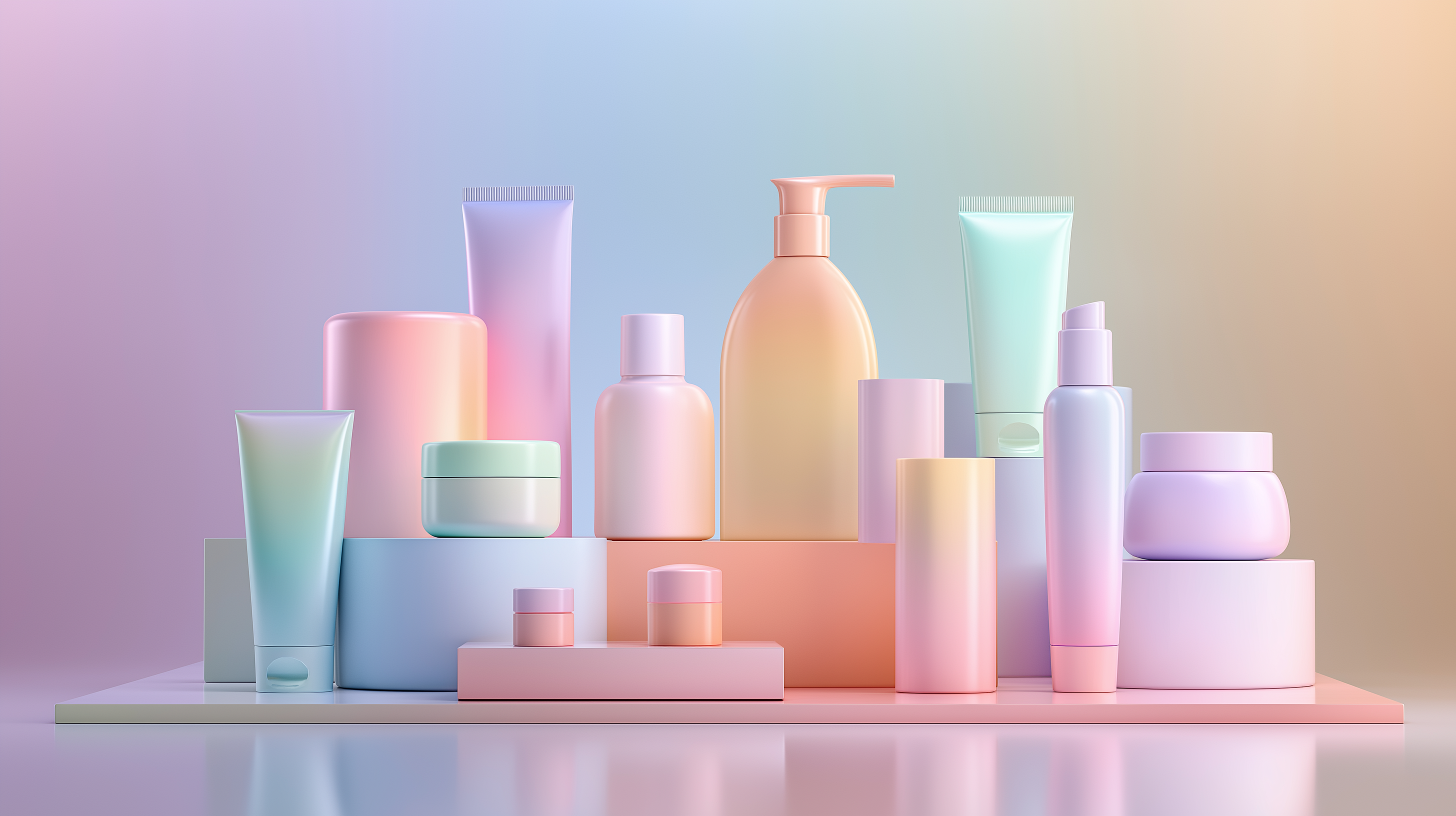
Warm tones—such as red, coral, peach, gold, and champagne—tend to evoke emotions of vitality, comfort, and approachability. They draw the eye quickly and often feel expressive, youthful, or sensorial.
Cool tones—such as blue, teal, mint, violet, and silver—signal clarity, calmness, and trust. They are strongly associated with purity, science, and effectiveness, especially in skincare categories.
How Warm Colors Influence Consumer Perception
Warm colors carry an emotional intensity that makes them instantly noticeable on the shelf.
Red and pink tones often communicate vitality, youthfulness, and beauty. They are commonly associated with color cosmetics like lipsticks, blushes, and fragrances, where expressiveness and emotional impact are key. Coral and peach provide a softer, more approachable warmth, frequently used in sensitive-skin or hydrating skincare categories. These tones imply gentleness without losing visual appeal.
Fenty Beauty uses bold, saturated pink and rose tones in its lip and cheek categories to emphasize empowerment and creativity.
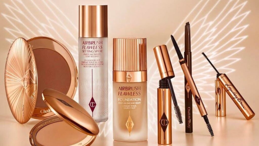
Charlotte Tilbury incorporates warm rose gold and soft rosy hues to create a sense of glamour and allure.
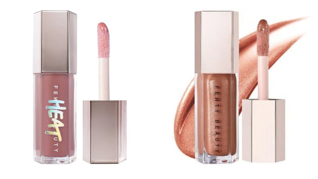
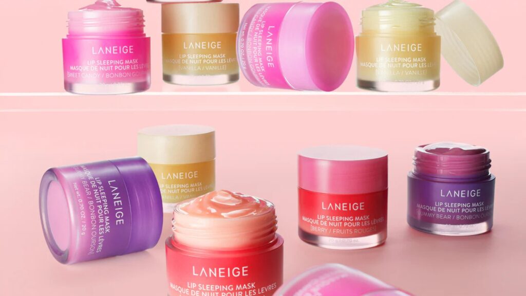
Laneige Lip Sleeping Mask uses a warm berry-peach gradient to communicate a comforting, sensorial experience.
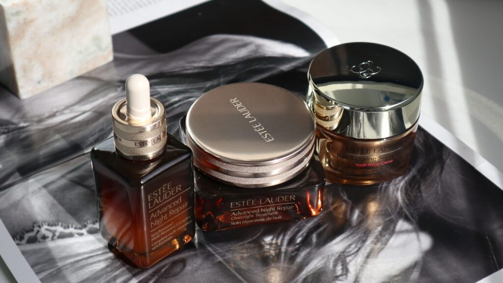
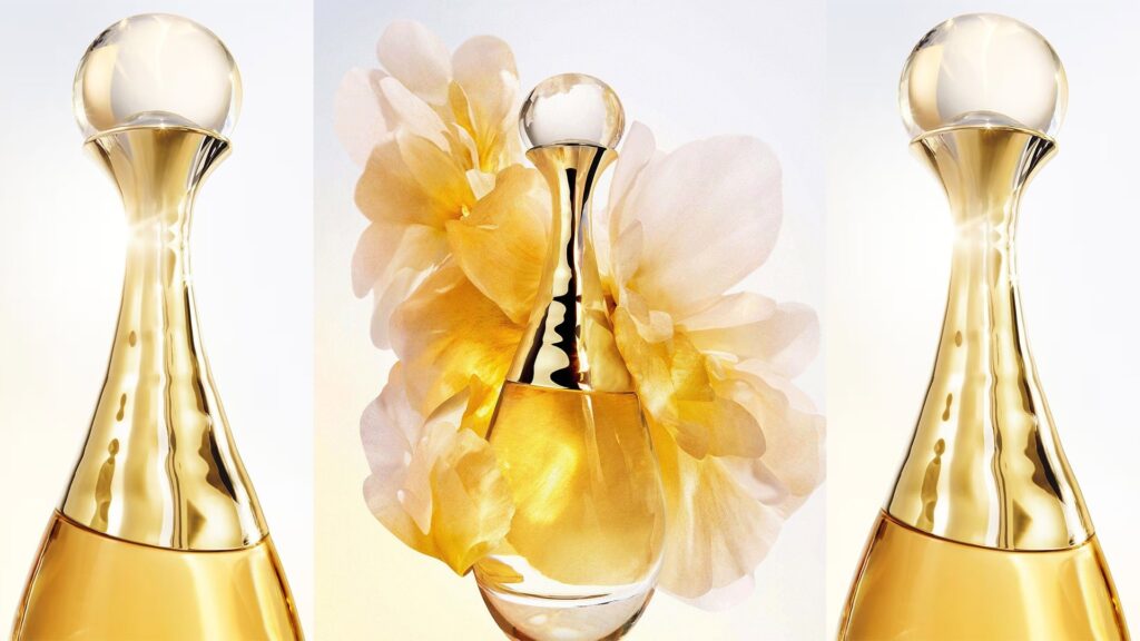
Gold and champagne are among the most powerful warm hues in the luxury segment. They symbolize sophistication, celebration, and premium quality—making them a popular choice for anti-aging lines, holiday gift sets, and high-end perfumes. Warm metallics also carry strong tactile expectations: consumers often perceive gold-accented or gold-toned packaging as higher in value, regardless of the actual materials used.
Estée Lauder’s Advanced Night Repair often pairs gold accents with amber-warm packaging to signal high performance and prestige.
Dior J’adore uses iconic gold metallic tones to evoke sophistication, celebration, and femininity.
According to color psychology research, warm hues stimulate emotional engagement and draw attention faster than cool tones. In a crowded market environment, this gives warm-colored packaging an immediate competitive edge.
How Cool Colors Shape Perception in Beauty Packaging
Cool colors bring clarity, calmness, and a sense of scientific credibility.
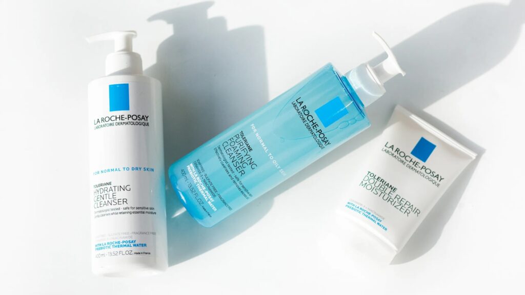
Blue and teal are among the most universally trusted hues in beauty. They are strongly associated with purity, hydration, and dermatological care.
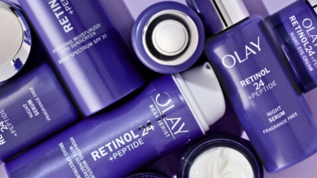
Purple conveys innovation and nighttime efficacy, while lavender adds softness and calm. Both are widely used in anti-aging or treatment-focused lines.
Silver and metallic cool tones are closely tied to advanced technology and high-performance skincare.
La Roche-Posay uses a medical blue to highlight clinical expertise and product safety.
Olay Regenerist Retinol 24 uses a signature purple jar to signal advanced retinol performance.
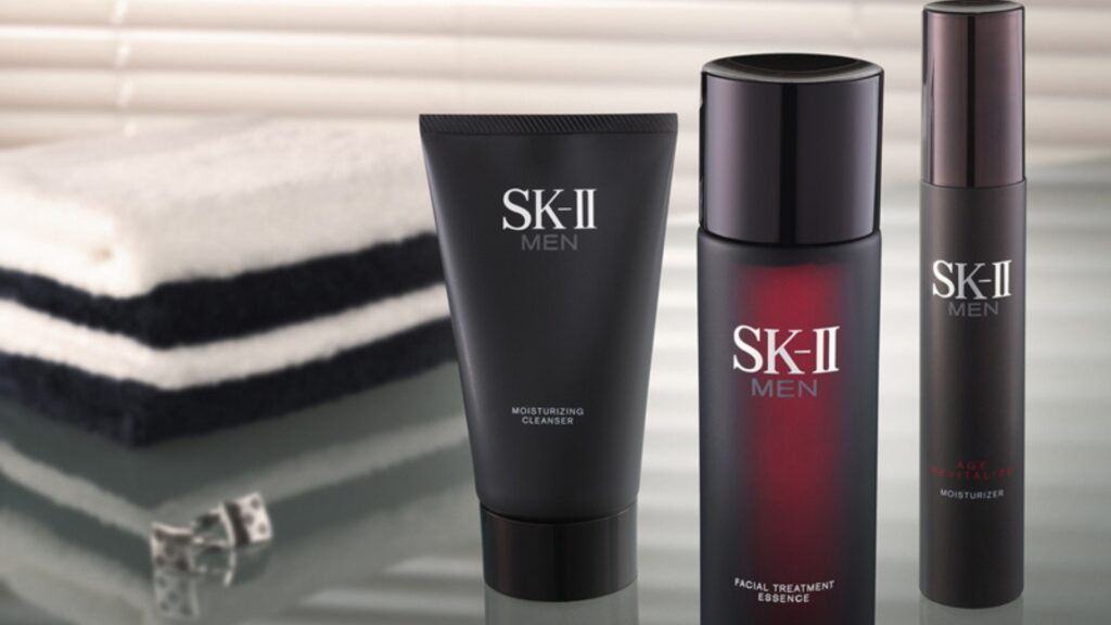
SK-II Men adopts cool metallic black–silver to reinforce performance, control, and modern sophistication.
Studies indicate that cool tones reinforce perceptions of science, purity, and reliability. In performance-led beauty categories, they offer a quiet but powerful competitive edge by signaling trust at first glance.
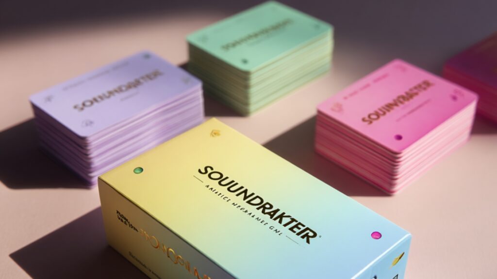
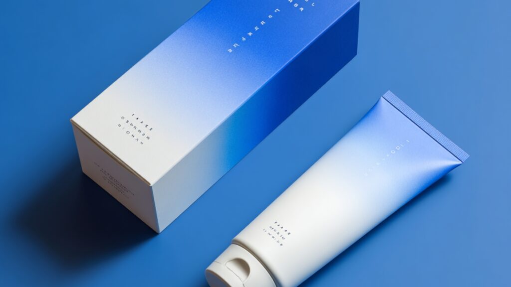
When Warm Meets Cool — The Power of Gradient & Dual-Tone Packaging
While warm and cool tones can powerfully influence consumer perception on their own, the combination of both creates a visual language that is even more dynamic and expressive.
The Visual Psychology of Gradients
When warm and cool tones blend seamlessly, this interplay makes gradients especially effective for products that promise multi-dimensional benefits, bridging sensorial appeal with functional performance in a single, cohesive design.
Understanding the psychology of warm and cool tones is only the first step. The true impact happens when these insights are translated into precise, consistent, and visually compelling packaging. This is where Visonpack’s finishing technologies play a defining role—enabling brands to express emotion, function, and identity through color with exceptional control.
Gradient Spray Painting for Smooth Warm–Cool Transitions
Gradient spray painting allows for seamless, controlled blends between warm and cool tones. Whether a brand wants to shift from gold to blush or blue to mint, this technique delivers fluid movement and layered depth—ideal for hybrid products, serums, and premium collections.
Gradient UV Metallization for High-Impact Luxury Effects
For brands seeking a more reflective, premium finish, gradient UV metallization offers metallic transitions that enhance both warmth and coolness. This method brings radiance and dimension to packaging, making it particularly effective for high-end skincare or fragrance lines.
Soft-Touch, Matte, and Rubberized Coatings for Color Temperature Control
Beyond color alone, texture can amplify how warm or cool a tone feels. Soft-touch matte finishes add warmth and comfort to peach or rose hues, while rubberized coatings stabilize cool tones like lavender or teal, reinforcing clarity and precision. Visonpack’s coating options ensure color temperature stays consistent across batches and product families.
Pearlescent and Metallic Shifts for Multi-Dimensional Visual Impact
Pearlescent spray finishes and cool metallic coatings add depth, shimmer, and temperature nuance. They help warm tones appear more radiant and cool tones more refined—ideal for luxury storytelling or elevated brand experiences.
By combining the emotional influence of warm and cool tones with advanced manufacturing techniques, Visonpack allows brands to transform color psychology into a tangible visual identity. Every finish becomes a strategic choice—one that shapes consumer perception, communicates product benefits, and strengthens the brand narrative from the very first glance.
Color temperature is more than a visual preference—it is a strategic tool that shapes how consumers feel, evaluate, and ultimately choose beauty products.
For brands, understanding the psychology behind warm and cool tones opens a path to more intentional, effective packaging design. And with Visonpack’s advanced finishing technologies, they can be executed with precision and consistency across any product line.
Ultimately, great packaging does more than look appealing; it communicates identity, reinforces benefits, and builds trust at first glance. By integrating color psychology with the right manufacturing techniques, brands can create packaging that not only stands out on the shelf but also tells a compelling story—one that consumers intuitively understand.